


LG Product Support Site
2022 - 2023
Client
LG Electronics
Role
Product design lead
UX research
Visual design
Interaction design
Prototyping
Team
5 designers
1 design director
1 product manager
1 client partner
4 product owners
Brief
LG.com has an average of 24 million visitors a month. My team was tasked with redesigning LG's ownership support experience across their current site, to improve the overall informational architecture and meet the standards of their products and e-commerce platform.
Problem Space
Problem Space
My team utilized a number of research methods to really understand the project's scope, problem space, specific user pain points, and opportunities for innovation.
Competitor Analysis
My team utilized a number of research methods to really understand the project's scope, problem space, specific user pain points, and opportunities for innovation.
Competitive Analysis
We analyzed 5 direct competitors in the electronics industry and how their support sites (mobile and desktop) structured navigation and organized product information. We identified the following positive trends:
Navigation was simple, with support information organized according to product.
Site utilized both global and page-level search functions.
Users could follow multiple alternative paths to specific services and resources.
Tree Testing the Navigation
Tree Testing the Navigation
My team speculated that simplifying the support site's menu could improve usability. To quickly and effectively evaluate that navigational hierarchy, we conducted 2 concurrent tree tests with 183 participants.
Test A used the current LG support site navigation, while Test B used a simplified version of the LG support site navigation (fewer menu items/ nested titles).
Test B saw a 26% increase in completion.
LG's navigational task flow
Identified Pain Points
We then moderated 10 usability studies to get direct feedback from real end-users. To reflect LG's diverse client base, participants lived across the United States, held a variety of occupations, and ranged in age from early 20s to late 60s.
Identified Pain Points
Users found navigation confusing, with repetitive language.
Users have to scroll and click through multiple pages of results to find their specific product.
Product pages needed hierarchy, consistent style application, and succinct naming conventions.
Users noted that global and page-level search lacks logic, producing unhelpful results.


Navigation was flagged by study users as confusing and cumbersome.


Participants complained there were too many product results and no way to filter them.
Building the Structure
Because my team planned to reconfigure the site's navigation, we needed to create the informational architecture before jumping into flow iterations.
Competitive analysis and usability testing also revealed a clear navigational constraint: To access support site functions and services, users need to select a product. Based on that insight, we designed a product-oriented structure for the support site, reflective of LG's existing shopping platform.
Identified Pain Points
Process
Users found navigation confusing, with repetitive language.
Users have to scroll and click through multiple pages of results to find their specific product.
Product pages needed hierarchy, consistent style application, and succinct naming conventions.
Users noted that global and page-level search lacks logic, producing unhelpful results.
Participants complained there were too many product results and no way to filter them.
Navigation was flagged by study participants as confusing and cumbersome.
Building the Structure
Because my team planned to reconfigure the site's navigation, we needed to create the informational architecture before jumping into flow iterations.
Competitive analysis and usability testing also revealed a clear navigational constraint: To access support site functions and services, users need to select a product. Based on that insight, we designed a product-oriented structure for the support site, reflective of LG's existing shopping platform.
Process
Informational Architecture
Wireframes
Once we received LG's approval, part of our design team worked on wireframes, then presented their iterations to the rest of the group for feedback. I provided comments and in-person critiques to help refine flows through several rounds of review.

Solution
I refined LG's design system in tandem with the designers producing wireframes. I saw an opportunity to improve the existing system, as a whole, by establishing consistent, accessible, and scalable design foundations.
Read the case study for that project here.
With these updated foundations in place, I worked on creating and prototyping the high-fidelity interfaces. I was also in charge of ensuring we followed the updated design system and component library correctly.
Solution
Resources Centrally Located
Users now have a central hub where they can search for products and access links to all resources, activities, and services.
Solution
We grouped resource links in cards to make them readily accessible. During testing, users frequently mentioned wanting a section specifically for "troubleshooting," so we used that nomenclature.


Navigation was flagged by study users as confusing and cumbersome.
Participants complained there were too many product results and no way to filter them.


Users can search by product number or select product cards to go to sub-category landing pages, giving them multiple "happy paths."
Clear Benefits
LG leadership wanted to encourage the company's product registration program, so we clearly displayed registration benefits and made the process more easily accessible through a screen overlay.


Selecting "Register" launches the registration model directly over the All Support page.
Built to be Accessible
Testing showed that users had difficulty finding warranty information, manuals, error codes, and specs for their products, so we put all those resources on product-specific pages. Users can reach out to repair services directly from there and order new parts.


All information is tailored to each product
Results
User Testing
To gauge the effectiveness of our redesign, we ran 60 usability tests, 10 moderated and 50 unmoderated.
90% of of users said there was nothing confusing about the updated menu options. 94% of users said there was nothing missing or difficult to find in Product Support. User-reported ease of use increased by 29% and overall accessibility by 219%.
Suggestions
Although our product support redesign received positive user feedback, testing also showed us which areas of the site needed more updating. We were working with time constraints, so we created a list of recommended future improvements for LG to implement:
Either eliminate the Support Menu or nest menu items based on user-assigned importance.
Change the name "All Support" to "Support" so that users have one page with all support options instead of the Support Menu.
Leverage AI or a chatbot to improve search functionality.
Make sections across all Product Support pages expandable and collapsible.
Results
Results
.png)
Customers now have a "happy path," where they arrive on the main support page, search for their project, and then get the support services they need.
1.
Customers also have alternative secondary paths, where they arrive on the main support page, go past the product search options, and start their support search based on functionalities.
2.

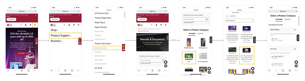
Search Based on Product
Users can search for product support resources with either the top-level search bar or by clicking through product sub-categories. We chunked products according to functionality and nested them in accordions to keep results organized.
Brief
My team was tasked with improving LG's ownership support experience across their current site. As a design lead for this project, I was responsible for establishing visual guidelines for the interface that maintain LG brand standards.
Client
LG Electronics
Role
Visual design lead
Experience design
Visual design
Interaction design
Team
5 designers
1 design director
1 product manager
1 client partner
4 product owners
Brief
LG.com has an average of 24 million visitors a month. My team was tasked with redesigning LG's ownership support experience across their current site, to improve the overall informational architecture and meet the standards of their products and e-commerce platform.
Role
5 designers
1 design director
1 product manager
1 client partner
4 product owners
Team
Product design lead
UX research
Visual design
Interaction design
Prototyping
Client
LG Electronics
Problem Space
Brief
My team was tasked with improving LG's ownership support experience across their current site. As a design lead for this project, I was responsible for establishing visual guidelines for the interface that maintain LG brand standards.
Role
Product design lead
UX research
Visual design
Interaction design
Prototyping
Team
5 designers
1 design director
1 product manager
1 client partner
4 product owners
Client
LG Electronics

We grouped resource links in cards to make them readily accessible. During testing, users frequently mentioned wanting a section specifically for "troubleshooting," so we used that nomenclature.
Customers now have a "happy path," where they arrive on the main support page, search for their project, and then get the support services they need.
1.
Customers also have alternative secondary paths, where they arrive on the main support page, go past the product search options, and start their support search based on functionalities.
2.
Identified Pain Points
We then moderated 10 usability studies to get direct feedback from real end-users. To reflect LG's diverse client base, participants lived across the United States, held a variety of occupations, and ranged in age from early 20s to late 60s.
Identified Pain Points
Users found navigation confusing, with repetitive language.
Users have to scroll and click through multiple pages of results to find their specific product.
Product pages needed hierarchy, consistent style application, and succinct naming conventions.
Users noted that global and page-level search lacks logic, producing unhelpful results.